Skip to content
Email us:
support@e360digitalpro.com
Or Speak with our expert:
+1 727 273 7883
Home
Services
Cross Platform Application Development
Ecommerce Store Development
Web & App Development
PPC Services
Seo Services
Hybrid App Development
Custom Software Development
Automation Solutions
CMS Development
Shopify Store Development Services
Wordpress Development Services
Drupal Development Services
ERP Software Development
Digital Marketing Services
Social Media Marketing Services
Ui Ux Design Services
Web Design Services
Landing Page Design Services
Website Redesign Services
Let's Build Great Things Together!
Call Us at:
+1 727 273 7883
Email Us at:
support@e360digitalpro.com
Case Studies
Partnership
Contact Us
Estimate Your Project
Home
Services
Cross Platform Application Development
Ecommerce Store Development
Web & App Development
Custom Software Development
Automation Solutions
CMS Development
ERP Software Development
Case Studies
Partnership
Contact Us
Estimate Your Project
Don't Get Left Behind: Leverage AI for Marketing Campaigns in 2024
Grow Your Business with TikTok: 5 Easy Ways to Get Started
5 Reasons Why Your Small Business Needs Digital Marketing
Will Devin AI Steal Your Job? Everything You Need To Know About This AI Software
What is TikTok Dropshipping? A Beginner's Guide for 2024
Search Posts
Search
Search
Categories
FAQs
Guides and Recommendations
News & Information
Resources
Tips & Tricks
Trends & Insights
Tags
amazon
apple
artificial intelligence
branding
content marketing
development
digital marketing
email marketing
facebook
freelancing
graphic design
instagram
seo
social media marketing
tiktok
website development
Popular POSTS
5 Common Social Media Ad Mistakes and How to Avoid Them
March 7, 2024
Read More
A Beginner's Guide to Apple Vision Pro! The Future of Technology?
February 27, 2024
Read More
5 Red Flags: Why Your AI Content Might Not Rank on Search Engines
February 20, 2024
Read More
Top 6 Much-Needed Skills for a Full Stack Developer in 2024
February 10, 2024
Read More
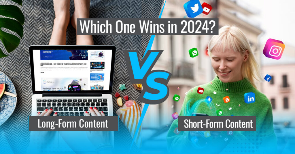
Long-Form vs. Short-Form Content: Which One Wins in 2024?
February 2, 2024
Read More
No posts found
Sort By:
Default
Date
Title
Random
Default
Date
Title
Random
Order:
Default
Ascending
Descending
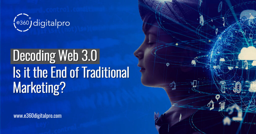
Decoding Web 3.0 - Is it the End of Traditional Marketing? Let's Find Out!
January 26, 2024
Read More
Wеb Dеsign Trеnds for 2024: What's In and What's Out?
January 16, 2024
Read More
5 Game-Changing AI-Powered Tools for Graphic Designing That Will Blow Your Mind
November 27, 2023
Read More
The Future of Social Media Marketing: Trends to Watch in 2024
November 17, 2023
Read More
Decoding SEO: On-Page VS Off-Page
November 10, 2023
Read More
The Metaverse Needs You: How to Build a Thriving Career in This New World?
October 27, 2023
Read More
Are You New to Website Development? Here Are 5 Golden Rules to Master It
September 30, 2023
Read More
Master These Top 10 Content Marketing Trends to Crush it Online!
September 21, 2023
Read More
Learn From Our Experience! Top 6 Things to Avoid While Starting a Business on Amazon
September 8, 2023
Read More
This is How AI Is Revolutionizing Graphic Designing: Get on Board or Get Left Behind
August 29, 2023
Read More
e360Digital: Put Your Brand In The Limelight With Our Tailored Solutions!
August 4, 2023
Read More
Responsive Vs Non-Responsive Websites: Which One Wins the Crown?
July 21, 2023
Read More
Upwork Decoded - The Secrets to Capture a Retainer Worth $5000 a Month
July 17, 2023
Read More
Why People Fail At Freelancing? We Interviewed A Top-Rated Freelancer And A Beginner
July 10, 2023
Read More
Becoming a Millionaire through Freelancing Overnight: A Sweet Lie
June 23, 2023
Read More
Personal Branding: The Secret Sauce To Stand Out!
June 23, 2023
Read More
No posts found